Color Explorations: Iterative Palettes and Studies
Start with a constrained study
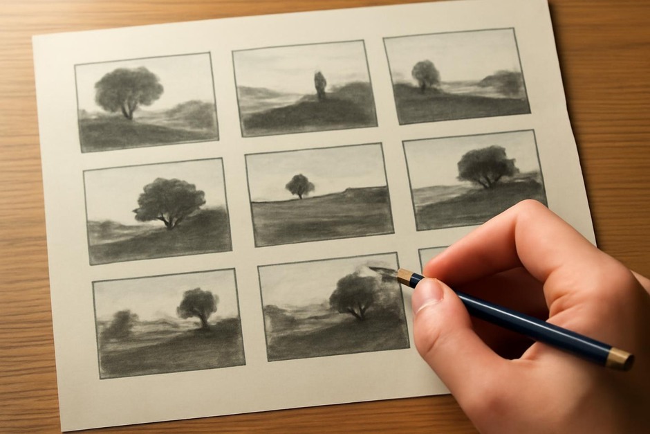
Color decisions become clearer under constraints. Begin with a small value block-in or a simple silhouette study. Limit yourself to three colors plus neutrals and focus on relationships: dominate, support, and accent. The objective is to learn how small shifts in hue, saturation, or temperature affect the whole picture.
Three-step color routine
- Block value and choose a key. Establish a clear value hierarchy first. Decide if the piece will be a warm key, cool key, or neutral key. This key guides your palette selection.
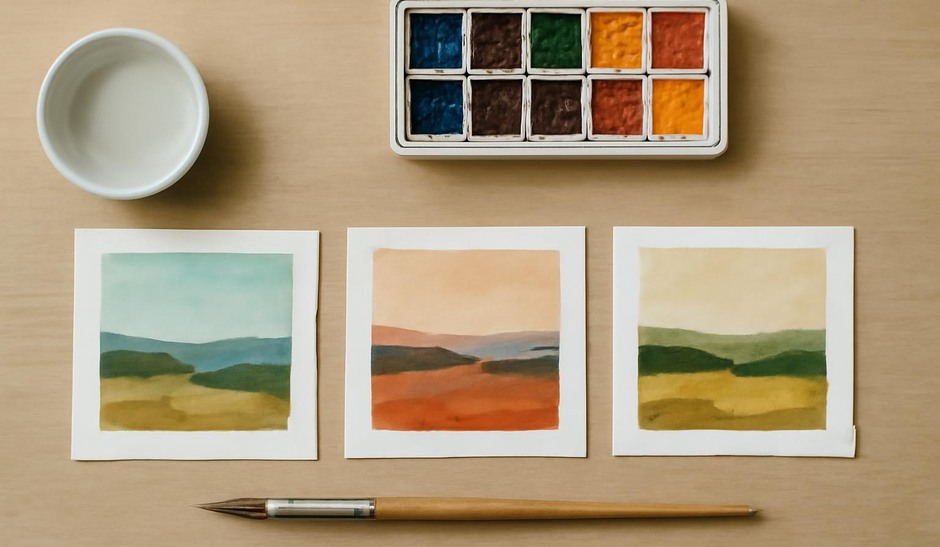
- Create three palettes. For the same value study, apply three distinct palettes in separate layers or documents: one harmonious, one contrasting, and one limited monochrome with a single accent. Spend 10 to 15 minutes on each palette.
- Iterate and annotate. Compare the three results and annotate what each palette changes in emphasis. Note which areas lose or gain clarity and whether the focal point remains readable.
Exercises to sharpen color sense
- Hue rotation test: Take one completed study and rotate all hues by a fixed amount. Observe how the mood and material perception change while values remain constant.
- Saturation sweep: Create a set of five variations where you progressively desaturate the background while maintaining saturated accents. See where accents read best.
- Local color swap: Swap the local color of one element (for example, clothing or hair) across three palettes and assess how it affects figure-background separation.
Practical habits for palettes
Keep a small palette library of 20 to 30 tested palettes labeled by key and mood. When starting a new study, pick two to three palettes from the library and run quick passes. Over time the library becomes a personalized toolkit that helps you make faster color choices without trialing endlessly.
When critiquing color, focus on three aspects: clarity of value, readability of the focal point, and harmony of relationships. A palette that looks striking in isolation may fail if it reduces contrast at the wrong location. Iterative palettes help you see these trade-offs quickly, and small, focused experiments build reliable color judgment.